I looked to change the icon and colours with feedback received in mind.
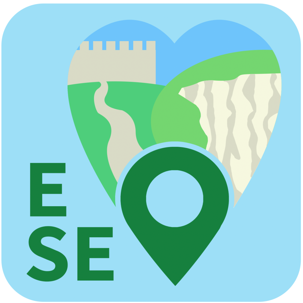
I first returned to the concept I had progressed most with the word mark. I started at the original colour palette as it important to keep the colours grounded and then work in the ways to make the palette more distinct. Keeping in mind the issue of mis-reading the acronym “ESE” as “SEE”, I switched the letters back to the left side of the shape. I also greatly reduced the size of the GPS pin in the shape based on feedback that I must avoid the design looking like a generic map route-finding app, making sure that the appeal of the southeast and sharing/photos aspect comes through. This exposed more of the simplified landscape with space going to the cliff and hill increased.
This colour change was inspired by my experimentation. Moving away from a light blue dominating helps to keep the app feeling warmer and less basic or unsophisticated. The colours seem to complement each other well enough here, with no tones struggling or clashing. The light colouration for the pin is an important touch to make the pin stand out less and feel more merged in with the heart shape, as it’s this shape which intends to uphold more of the human aspect of guiding positive experiences and sharing them.
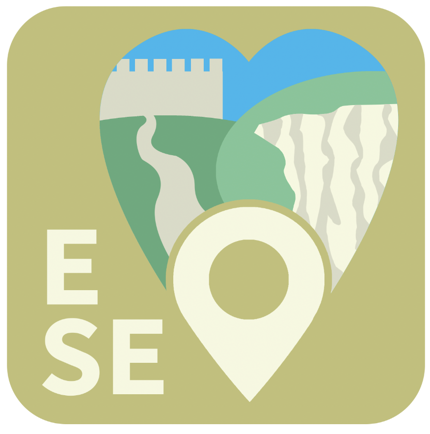
It was at this point in experimentation I removed the acronym from the icon. I found that the heart-pin shape communicating the southeast carries enough about the app not to need to reinforce the name there, and it was perhaps making the heart feel less strong and effective by placing it off-centre. Here I lean more into shades of green remembering its effectiveness in signifying to the appreciation of nature, an important part of the appeal of these exploration experiences. Losing the light blue colour completely helps the logo to feel more balanced and focused; too much attention was drawn to the sky when it was the last blue feature. Bringing the orange in to fill the sky is an effective way of bringing the colour palette away from the prescriptive “obvious” choice, as the sky forms a part of the scene that doesn’t cause misreading with a different colour choice, especially as the sky can take an orange hue with sunrise or sunset. The shade of orange has warmth without being too bright, not throwing off the balance.

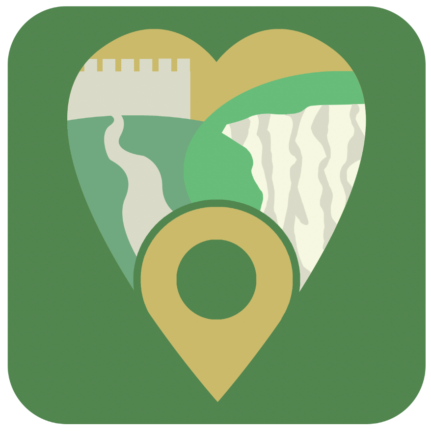
This final colour change helps the orange of the sky compliment the green of the hills more with a stronger tone of green. I decided to apply the same green to both hills after reluctance in the scene not making sense without that separation. The separate cliff and castle features still come through signifying the southeast without the divide in hill colour, and it means the icon is slightly less complicated with less different colours – which is important because the icon is at the more complicated end of what I have identified as icons/logos associated with successful comparable services. I found the darker aquatic blue as an effective way of having a background colour that differs from the green enough to keep the shape clear whilst not overpowering the icon’s form. Cliffs are to be associated with the sea so I aim to be supporting the cliffs (as the thing that can most assuredly separate the southeast from the rest of the UK) with this choice of colour that can come through as a sea tone.
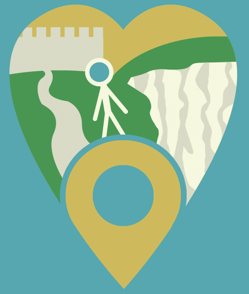
Here I tried out an abstract representation of a person, acknowledging feedback that it may add value to include people as this gets across the focus on human experiences and connection. The stick person form using colours already in the palette doesn’t seem to sit well on this concept, becoming too busy with this in addition to everything else. I also fear the stick person may come across as too basic and even childish despite my efforts against this in not adding a face and not adding a different colour.
I decided to pursue a similar (using the same signifiers and colour palette) but different concept to make sure I am exploring alternative concepts properly. The main reason for this is to position the cliff in a way that helps to make it more focused and clear as to what it is. It also means the scene is tighter and the overall effect is slightly less complicated. The smaller pin which is situated in the location may be more appropriate for the function of the app and focus on appreciating surroundings. The castle wall placement also seems to be positive for an effective use of a thin space which is shaped larger to keep it recognisable as the logo needs to decrease in size. More space given to the curved path also helps to support the message more of making a journey, exploring on-foot.
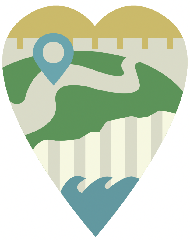
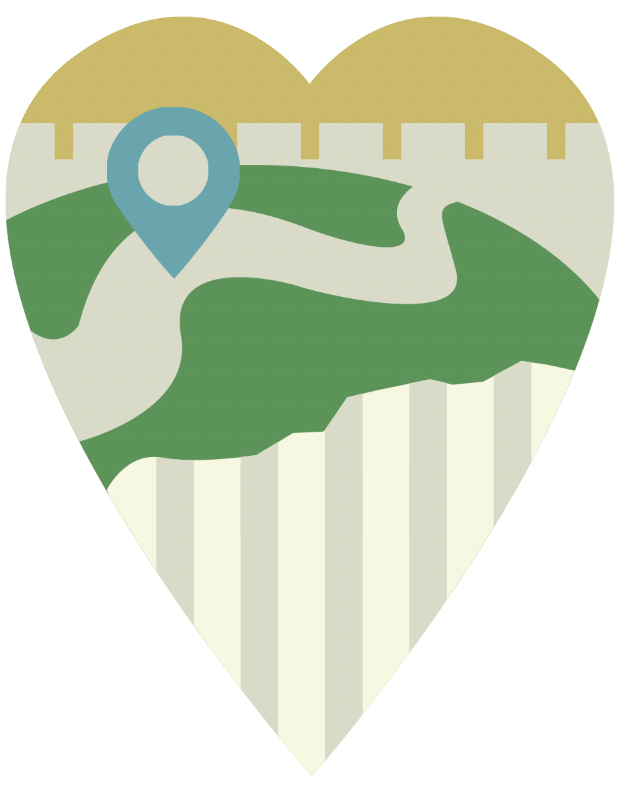
I note that I tried a concept that includes waves positioned to be clashing with the cliff. I decided against this as I felt it clashed with the perspective; pictured should be the top of a very high cliff, so placing haves here makes the cliff seem far shorter and therefore less impressive and not readily associated with the tall chalk cliffs in Kent and Sussex.

I tried a final unique arrangement using a more symmetrical design in attempt to help instant shape recognisability; there is a sense of “logic” to the symmetry. It could also be a benefit to have the path extending from the base of the shape, the pin, as something that is more inviting. Having the path be the only asymmetrical feature was a deliberate idea to give the idea of carving out one’s own path in exploration. I find issues with this composition that lead me to choose against it however. The path needing to run so close between these cliff faces is somewhat unsettling which makes the feeling experience of the icon less pleasant. The shape of the grass hill looks like the centre of a steering wheel which isn’t an ideal image as it doesn’t contribute something valuable to the sense of exploring nature. I tried the curved lines to give the texture of the cliff face as inspired by some clipart I found online to make this aspect seem more smooth, fitting better with the style of the castle wall shape or the hillside. I have reservations about whether this is really resembling the uneven partially shaded texture of a cliff face in any way.

I have settled on the second concept then with the cliff face at the base. I decided to switch the cliff texture to the original hand-rendered curved lines style as opposed to the straight lines because I find that this resembles a cliff face more, where the straight lines might look like blinds or a radiator, having a difficult time capturing the appearance of a rough cliff face even in a most simplified way. It also somewhat adds to the image of the free-flowing path, with these lines travelling up in a more loose way. This concept is slightly simpler than the original one which is positive for a small logo which can work for an app icon, and it places the signifying feature of the southeast prominently with the most prominent appearance of a path for the exploration also.
I produced a grayscale version to make sure it doesn’t lose all of its meaning without the colour, and it does still seem it could be recognisable as an interesting outdoor scene. The chalk cliff face does struggle to come through in this format but I keep in mind that, being an app internet-based service first and foremost, the sole exposure of the audience to this service should not be a grayscale print that might be found in practical business purposes such as a letterhead. The shapes can certainly link it back to the colour version for the audience member that is familiar with the colour logo.
