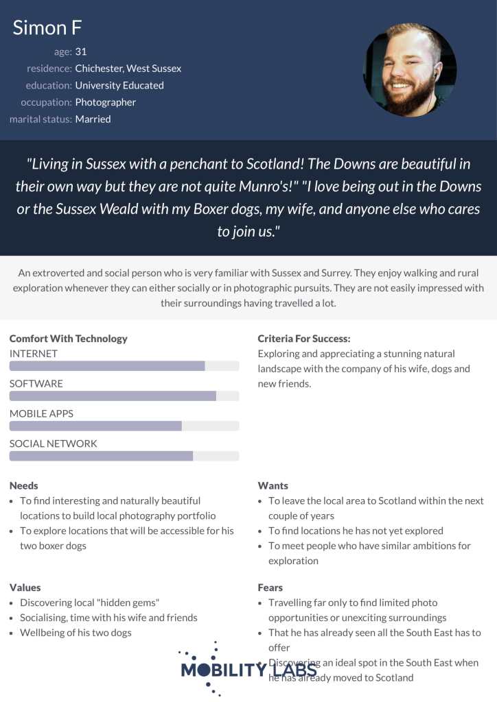
I started by setting out a criteria of what the most useful screens to produce and be able to promote with will be. I do this reflecting first on what the (self-initiated) brief sets out as I need of communicating, as well as reflecting back on the personas created.

- Screens should show appealing and varied locations in the southeast to meet the message.
- A screen should show a feature that reveals an ideal photo opportunity or point of interest in a close-range map, to meet the message of discovering spots.
- User-uploaded photos or stories linked to a place in the southeast needs to be displayed to meet the brief message too.
- Jeremy needs to see the user-uploaded feature specifically with a photo and some evidence that interactions can happen from this; a comments section likely.
- Jeremy wants to see some kind of variety of southeastern locations, including something that can offer a similar kind of exploration to the new forest (so a woodland or forest).
- Jeremy needs evidence that the app can help with navigation in a screen, using a GPS map feature.
- Simon needs a high standard of natural beauty displayed in the screens. He needs to be able to see this appeal in locations in the pre-trip browsing, before being on-location.
- Simon would like to see some evidence of a good standard of accessibility, perhaps in how locations are described.
- Simon values interesting or unusual “hidden gems” in the countryside.
- Adrienne needs as much information about destinations in advance as possible.
- Adrienne wants information to get a sense of what quality of walk she might find at destinations; perhaps based on variety of images or information.
- Adrienne needs a journey planner for the app to act as a guide to a stay in the southeast that centres on exploration experiences.
Resulting page ideas:
- Menu page with categories of exploration: coastal, historic, woodland, countryside, (suggest that there are more) – search bar and then categories below. The page should be visual with appealing varied photos in the southeast. It should imply that from here one can plan their exploration – find the kinds of destinations they want to see.
- Map with specific exploration locations (zoomed in for my photos). This should offer location-based destination recommendations. Photos and information about what the location is like in terms of what it offers for exploring, should be here.
- Closer map with photo spots. To accompany the exploration, a close map should direct people towards the exact best spots to see a point of interest, an ideal trail beginning, a great photo opportunity… at least one of these should be evident.
- Social page, with a shared photo that is shown to get some response perhaps with likes and a comment section, with an option “see on map” implies a specific location. Ideally this should feature a photo that can be placed in promotion with a different photo in the same location at a different time, for the “different perspective” appeal.
- A location profile with user submitted photos and an option to see reviews, as well as further information and a feature that suggests the app can guide the user to find this exact location.
- A journey planner screen, perhaps showing a collection of destinations or spots a user has found and has organised as a basis for a journey that the maps feature can guide them on.
I will pay attention to the app design that has inspired me and keep in mind that these screens will be promoted with some kind of explanation as to what is going on in them; not needing to make everything absolutely clear based on the screen alone as this might mean excessive labelling and text in the app design.


