With the app screens far into development my attention turned to making assets for the tabs that help the user navigate the app’s different features. Even when not producing a functional version, in promoting the app it should increase the audience’s confidence in a very important way to getting the impression that the app will be easy for them to use, with the necessary navigation features that they will be familiar with from other apps.
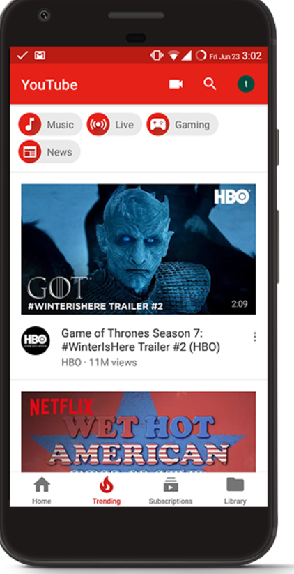
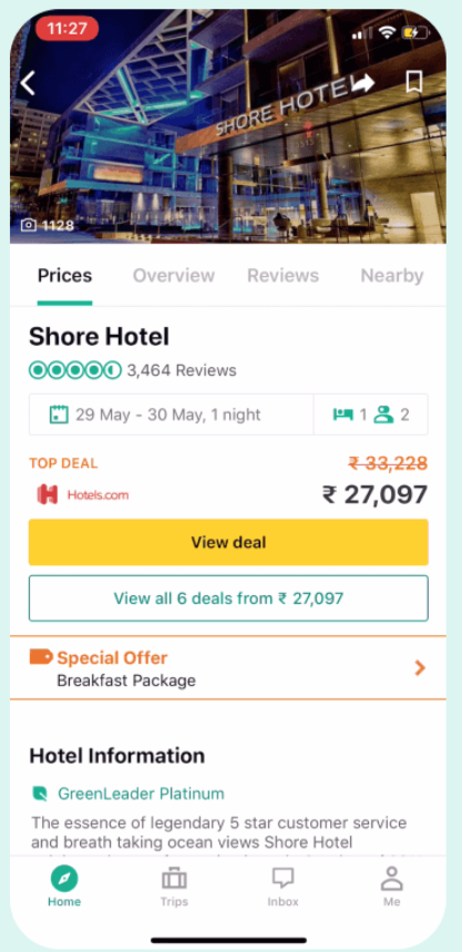

Looking through a variety of apps, the importance of keeping navigation with these tabs at the bottom and top o the screen is clear. They use icons representing what each page does or means, with a name of the section given in small text beneath. It is clear that the trend is towards using a single tone for the icons in the navigation menus, which differs from the background (being a darker shade of grey in these cases). A colour or inverse shading for the icon is used generally to denote that a certain part of the menu is currently selected. The icon designs are kept simple with the need to fit a small display area. What jumps out to me is how many examples – including all of the popular apps seen above – use that text below the icons. I looked into the conversation around using text to pair with icons vs leaving them to stand on their own, and the arguments are strong for the case of using this text. Icons give a strong representation of what a section does but it seems it is very unreliable to gain a perfect one, making it difficult to know that icons can readily be memorised by the user for their exact function of the part of the app they take the user to. Likewise, using just text makes it difficult for the user to instinctively navigate, so provides a strong visual hook to remind the user where the icon (in its position in the menu which must be fixed down) will take them.
I created the icons over the blue background as this would be the colour of the menu sections. I decided to keep within the colour palette to keep the tight brand identity visible, and I used the slightly darker tone of grey seen in the path and castle shape on the logo, for the single tone for all of these icons. Being in the position of using a very different colour (light grey on the blue) where many apps in my experience use a lighter or darker tone of the same colour (a darker grey on a lighter grey), I was careful not to keep the colour pairing here from being too strong as there is a subtlety to practical user-friendly app design. The specificity of the app means bringing in the colour more prominently does not become inappropriate (the colour palette is based on the south east and the entire app caters to this). But I found that the lightest grey colour in the palette (used on the main part of the logo’s cliff face) was a strong contrast against the blue which lacked the subtlety which inspired me, so the slightly darker tone came through as a better balance.
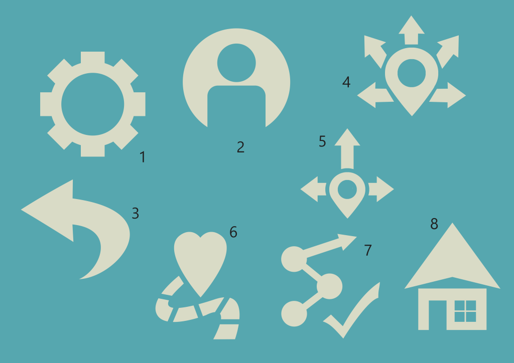
- The first icons I made were for the top menu. Observing apps it seems standard to offer access to a menu where the user adjusts various settings relevant to their experience using the app, so in promoting app screens it is worth including such a standard aspect for the app to come across as fully practical. I use a combination of rotated rectangles over a circle which I then cut a hole out of, for the cog shape I find most readily associated with settings options.
- This icon also for the top section resembles a section which would take users to edit their personal details and information, which would be necessary to uphold the app’s social features of commenting, leaving reviews, submitting photos, and planning their own routes. I found this very simplified representation of a profile of a person to be common in app design, not dissimilar to what is seen in the TripAdvisor example, simply using a circle and a rounded rectangle here to an appropriate effect. The icons can fit in with the app without needing to draw unneeded attention from a particularly unique style, as the utility of these icons is what matters.
- An arrow for users to go back seems to be very common in apps also for simple navigation. I found that some apps use a straight arrow, but that a curved arrow such as what I have shaped is common also. I needed to make sure from here that I could align all icons to fit within an even square/circle space, so the curved arrow better lends itself to taking up an even square area, not seeming too much drastically smaller than the profile and settings icons, carefully aligned to match their vertical elevation on the app.
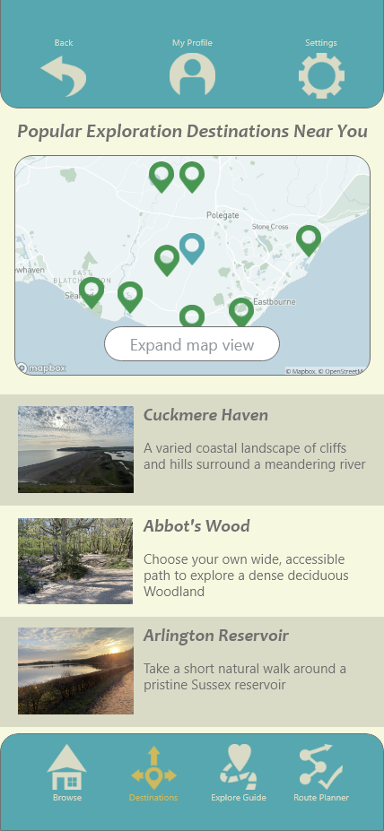
- This is the only icon I scrapped to adjust. Turning to the bottom row of tabs between the main sections app, this is for the part of the app which suggests destinations based on a location given by the user, and offers a detailed view of what different places will be like as is demonstrated with the app screen on “Cuckmere Haven”. As this feature is all about branching out from a set location, I have the GPS location pin with several arrows pointing out from that central point. Multiple arrows is an important touch to suggest the variety and exciting different possibilities of travel in the southeast, in a subtle way.
- This is the adjusted, improved version of the previous concept. I found the arrows in the previous numbered icon became too uneven and visually “busy”, not playing well into the idea of being simple and user-friendly. Limiting to the three arrows keeps options open but makes the concept more neat. I extended the top arrow in an effort to bring the icon closer to taking up and even space between the horizontal and vertical.
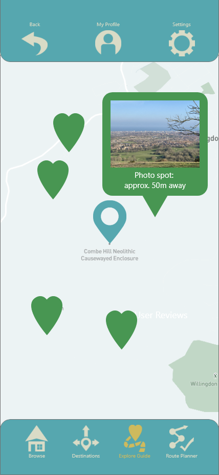
- This icon is for the local exploration feature where the user is guided to points of interest within walking distance. Since the GPS display on the screen for this uses the heart shape to mark points, it is a natural connection to include the heart here. I have a winding path leading to it as a small way to mark out the exploration journey and how the user can be guided directly towards something they’d like to see. The curved path had to be adjusted a few time to reach this balance of not taking up much space, and also not touching the heart except for where it reaches it at the end of the path.
- The icon for the route planner connects dots for its main component. This resembles the function of this feature of creating a journey plan which joins the things the user can identify as something they’d like to see. I end that with an arrow to gesture at adding to a journey and in general movement. I have a tick next to this as it seemed unclear without it, the tick was chosen as something which generally suggests making a plan; the checklist, knowing exactly what they want to do and with confidence ticking it.
- Finally this is the icon for the home browsing feature. To establish this is the first page for the most general, broad browsing, I wanted to use an icon representing a home as is seen for the home section on other apps I have encountered. To give a unique spin which relates to browsing to go places, I found that placing the arrowhead shape where the attached triangular shape of a roof would typically be has been an effective way of setting this apart and suggesting towards movement in a subtle way.

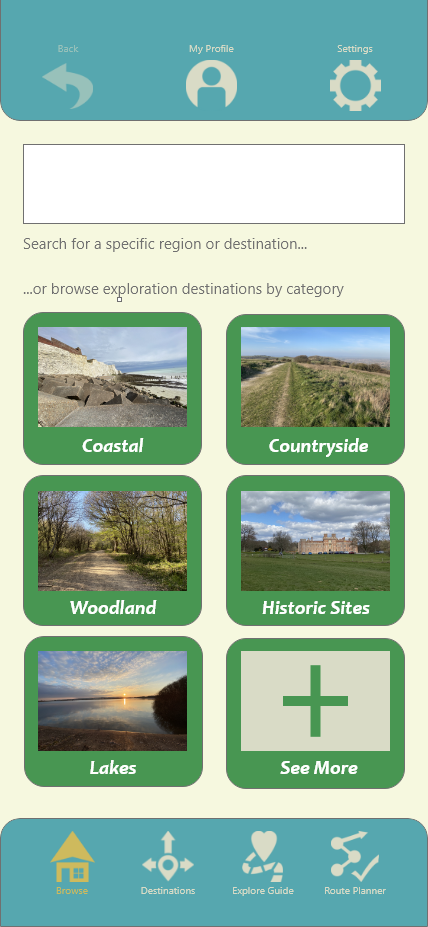
With all of these icons established I had to set them out on the app screen space with their names paired with them. The text has to be small but, observing existing apps, this size seems to be in-line with the smallest acceptable small type, such as what is seen on the text pairing with the icons on the bottom navigation area on the TripAdvisor app. I was careful to place all of the icons in-line with the evenly sized icons with even spacing and centred in the display.
I next found an image online of an iPhone 12 Pro Max display since this is what I am working with on Adobe XD, to see if the size of the space I left for the top and bottom menus needs adjustment to fit icons whilst leaving space for the essentials that take up space; time and battery information at the top and the drag up bar at the bottom of the screen. I had not left enough space at the bottom and had left too much space at the top, so I adjusted the bars accordingly to keep the icons placed with a comfortable space away from the essential features separate from the app.

To distinguish the section which is currently selected apart from the sections which are not, I first tried applying the lighter colour in the palette to one of the icons. Unfortunately the difference between this colour and the slightly darker one used for the icons does not come through enough, as can be seen with the difference between the icon above “destinations” against the other icons.
I changed the colour to set apart the item which is currently selected to the orange tone. This provides a strong difference to set apart from the beige without being too bold, as was already made sure of when it was introduced to the colour palette. Looking to the design of YouTube, I can observe the standard practice to use the more bold colour to denote what is currently selected.
Another change that can be seen on the screen above is that I have decreased the opacity of the “back” arrow. This is in effort to represent the fact that from this particular screen there is nothing to go back to. I found that removing the arrow altogether might be going too far and disrupt the spacing of the design, so I use this to suggest to the user that the button is effectively out of order on that page.
The screen above gives the other changes I made in applying the other major typeface of the identity to the app for the larger parts of text. As the type was selected to come across as more bold and suggesting movement, heading somewhere in italic, it may have merit to including in the app design to add some visual interest which isn’t overbearing. I am satisfied with the results in this screen making the categories stand out more whilst not impairing readability to any concerning degree.

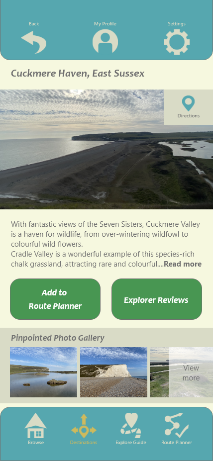
Here as a page that the user can “go back” on, the back arrow in the top-left is fully exposed. I adjusted the shape of the button to have the same design as the “see more” category on the previous page, being more consistent through the app. I broke up the text which sat in that area by moving the location information to the top-right of the photo, since this is where the location option is found in the destination page (Cuckmere Haven), so in the interest of consistency. In that corner I also adjusted the sizing of the “heart” counter to be more equal with the heart shape.

For this page I kept up the menu changes and text changes. To match the icon for the route planner I improved the appearance of this page by linking the plots on the map to show a route in place.
I made these changes consistent across the screens to reach a point where I am confident the screens can appropriately represent the app’s features in promotion.
 Luke Whatley Design WestKent PART 2