With the 6 screens of the app I used to appropriately reflect the app’s main different features in promotion, I would need to apply them in ways that briefly outline what the screen shows, how this may be useful for and appealing to the audience.
I have found that one of the most direct ways of promoting screenshots of an app is to place them in promotion for an App Store online. This may very often be the first point that a potential user will see the app as it precedes the decision whether or not to download it, so would be a worthwhile way to promote the “screenshots” for the brief.
.png)
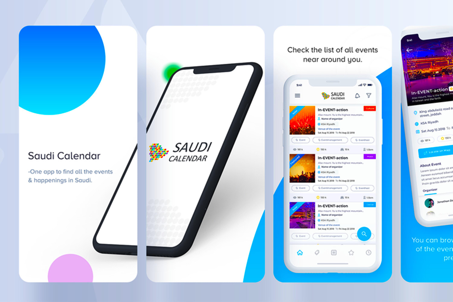
First taking inspiration from how other apps use promotional screens, I notice interesting themes above. The screenshots are placed on a background relevant in upholding an identified colour palette in a way that connects the screens together. I can see that the wave of the background is consistent across the screens where it can be seen. It uses short captions outlining the main features of the app which they expect will be most appealing. The screenshots seem to act as evidence to back-up the features the app claims to hold in those brief captions. An interesting touch is the use of joining the two screenshots together on the far-left of these – which I understand to be the first two screenshots that the user will look at. This seems to be a creative way to bend the conventional usage which would be for each segment to hold a different screenshot with a different feature. Some form of continuity – either this or the wave of the background – help to guide the eye across to observe all of the different screens.

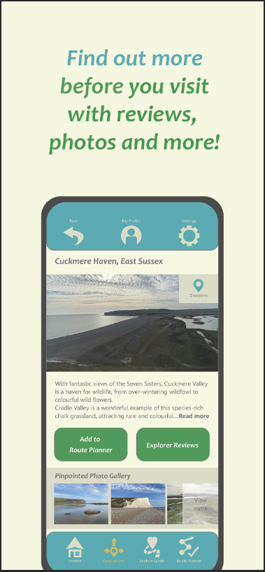
Above is another example of using quick captions above screenshots as evidence. The layout is more conventional and consistent with the screens and captions in the same place for each one, perhaps conveying a sense of stability which would make sense for an app with usage that is more practical than playful.

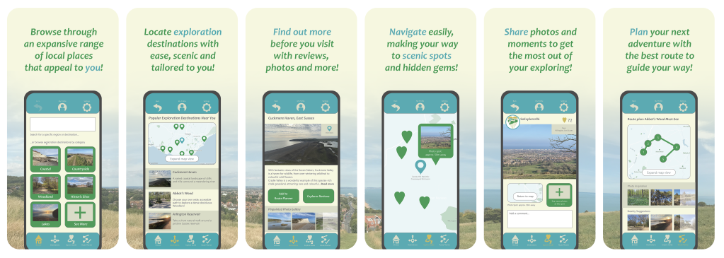
These app screens go back towards a background which joins up across the screens, and adds variety to the placement of the screenshots. This helps the app to seem more dynamic, having spots of colour in the backgrounds and turning the phone screenshots to different angles, and having captions change their positioning around this. What I take from these different approaches is the need to have some kind of continuity across the screens to guide the eye to read on – balancing this with having captions stand out and clearly linked to the relevant screenshot.

I start with placing a screen on a background with a solid colour from the colour palette. I use a black outline to resemble the edge of a phone in an abstract way. Some examples use a flat approach like this such as the first one I looked at in this post. I chose this as a way to quickly produce the look of the phone screenshot without taking someone else’s mock-up and using it too prominently. Important is the content of the screen as there is no attempt to sell the phone itself.

The space above the phone is filled in with a caption, in a similar layout to the 2nd example I looked at. I bring in colours from the palette which sit well on the light background, adding a little variety by switching from green to blue for emphasis.

The screens were in need of something to bring them together to guide the eye across, and to break up the dullness of having one solid colour. I resolved to use a panoramic photo across the 6 screens, as its suitably large size could keep them all joined together. Keeping photographs present on designs comes across as an ideal way of keeping the appeal of exploring the southeast clear. So I divided the photo into 6 even sections using shapes, with gaps to account for how screens display on the app store. Using such a large scene of a panoramic may help to subtle give the sense that there is a lot of area one could explore.

Here I have a section of the panoramic taking up the lower half of the background, clear of the caption towards the top. The thick outline around the screenshot helps to keep the panoramic from becoming too distracting. I also decreased the opacity of the photo in efforts to keep attention towards the screenshots which the captions will describe.

Here is the complete line of screens in the same format. The panoramic is crucial in breaking up the plain background and keeping the screens linked together in a visually interesting way.

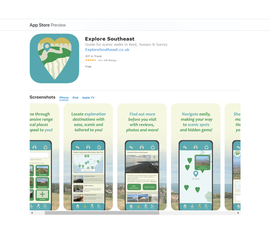
With no convenient mock-up options for this, I took to finding an existing standard example of promotional screens in the app store that I could overlay. It is important to show what I made the screens for, how they fit in as required.

Here is the result of matching up the screens I made to TripAdvisor in the App Store. I replaced the text with similar font styles and at the same size to help to preserve the look which allows it to be perceived as an official view of the App Store.