FMP Branding: App Promotional Screens

With the 6 screens of the app I used to appropriately reflect the app’s main different features in promotion, I would need to apply them in ways that briefly outline what the screen shows, how this may be useful for and appealing to the audience.

I have found that one of the most direct ways of promoting screenshots of an app is to place them in promotion for an App Store online. This may very often be the first point that a potential user will see the app as it precedes the decision whether or not to download it, so would be a worthwhile way to promote the “screenshots” for the brief.

LaunchMatic - App Screenshot Generator

First taking inspiration from how other apps use promotional screens, I notice interesting themes above. The screenshots are placed on a background relevant in upholding an identified colour palette in a way that connects the screens together. I can see that the wave of the background is consistent across the screens where it can be seen. It uses short captions outlining the main features of the app which they expect will be most appealing. The screenshots seem to act as evidence to back-up the features the app claims to hold in those brief captions. An interesting touch is the use of joining the two screenshots together on the far-left of these – which I understand to be the first two screenshots that the user will look at. This seems to be a creative way to bend the conventional usage which would be for each segment to hold a different screenshot with a different feature. Some form of continuity – either this or the wave of the background – help to guide the eye across to observe all of the different screens.

5 Tips for Designing App Store Screenshots That Get More Users - Localytics

Above is another example of using quick captions above screenshots as evidence. The layout is more conventional and consistent with the screens and captions in the same place for each one, perhaps conveying a sense of stability which would make sense for an app with usage that is more practical than playful.

Design professional app screenshots and app store screenshots by Hamza1080p  | Fiverr

These app screens go back towards a background which joins up across the screens, and adds variety to the placement of the screenshots. This helps the app to seem more dynamic, having spots of colour in the backgrounds and turning the phone screenshots to different angles, and having captions change their positioning around this. What I take from these different approaches is the need to have some kind of continuity across the screens to guide the eye to read on – balancing this with having captions stand out and clearly linked to the relevant screenshot.

I start with placing a screen on a background with a solid colour from the colour palette. I use a black outline to resemble the edge of a phone in an abstract way. Some examples use a flat approach like this such as the first one I looked at in this post. I chose this as a way to quickly produce the look of the phone screenshot without taking someone else’s mock-up and using it too prominently. Important is the content of the screen as there is no attempt to sell the phone itself.

The space above the phone is filled in with a caption, in a similar layout to the 2nd example I looked at. I bring in colours from the palette which sit well on the light background, adding a little variety by switching from green to blue for emphasis.

The screens were in need of something to bring them together to guide the eye across, and to break up the dullness of having one solid colour. I resolved to use a panoramic photo across the 6 screens, as its suitably large size could keep them all joined together. Keeping photographs present on designs comes across as an ideal way of keeping the appeal of exploring the southeast clear. So I divided the photo into 6 even sections using shapes, with gaps to account for how screens display on the app store. Using such a large scene of a panoramic may help to subtle give the sense that there is a lot of area one could explore.

Here I have a section of the panoramic taking up the lower half of the background, clear of the caption towards the top. The thick outline around the screenshot helps to keep the panoramic from becoming too distracting. I also decreased the opacity of the photo in efforts to keep attention towards the screenshots which the captions will describe.

Here is the complete line of screens in the same format. The panoramic is crucial in breaking up the plain background and keeping the screens linked together in a visually interesting way.

With no convenient mock-up options for this, I took to finding an existing standard example of promotional screens in the app store that I could overlay. It is important to show what I made the screens for, how they fit in as required.

Here is the result of matching up the screens I made to TripAdvisor in the App Store. I replaced the text with similar font styles and at the same size to help to preserve the look which allows it to be perceived as an official view of the App Store.

FMP Branding: Style Guide

A key deliverable to meet the self-initiated brief is to produce a style guide. I started by taking inspiration from existing style guides to establish a format and contents that would be appropriate for a relatively smaller range of brand identity aspects to uphold.

50 of the best style guides to inspire you | Canva

The A4 document style seems very appropriate for a style guide which consists of just a few pages, not in the position to form a full booklet. As I know from the brief requirements, I need to specify the associated typefaces, colour palette and all versions of the logo. The style guide above makes the appropriate choice to use a grey shaded background, so that when examples of solid white and black elements need to be used, the background is a suitable surface for either. I note that my placement flexibility may need to be greater when I consider the use of photography that will come into promotional materials and the range of 5 key colours in the logo. The above guide uses subheadings with lines that break the sections clearly, and implements the identity it sets out in this style guide as is needed to set an example.

Reflecting upon a style guide I produced for a previous project, I notice much of the same contents will be needed again. The ethos, the colour palette with a guide on usage, type variants, logo variants, the exclusion zone, and placement limitations.

There are a few ways in which the style guide I produced before, in the same kind of document format I am looking to again, could be improved that I will be looking to address for this one:

  • There is no grid structure and design elements to help properly separate the different parts. It doesn’t read consistently and with proper spacing, so I need to have columns in place and a way of properly separating different elements – not just oversized subheadings.
  • I need to look into pantone colour as an additional feature of the colour palette, as this will help the guide to look more professionally functional for different printing needs. I have observed there is an industry standard in providing pantone to cut down on ink usage which some printers prefer to use.
  • I will provide more variants for the logo than I made for the previous project, to help the identity with versatility.
  • I need to take a visual element from the logo to make the exclusion zone easier to follow at any size.

I establish the contents for this style guide as such:

  • Page 1: Info about us. It is important for the designer to understand the main ethos of Explore Southeast, the feelings the audience should be gaining, so starting with a written piece about the message would be most appropriate.
  • Page 2: Colour and type. Outlining and concisely describing the function of the colour palette, with grid number, RGB, CMYK and Pantone. I also name the fonts Candara Bold Italic and Segoe UI and concisely describe their usage.
  • Page 3: Logo and its variants. A variant with a full-sized wordmark, with a smaller wordmark beneath the icon, without a wordmark, colour and grayscale variants.
  • Page 4: Placing and misusing the logo. I provide the exclusion zone which uses a segment of the icon to follow, show how the logo can be placed on certain backgrounds and how the logo should not be placed or manipulated.

I started with applying a 3-column structure to all pages in InDesign. The outside margins keep to the standard of 25mm on A4, and I keep the gutters at 10mm as I found this to be an appropriate separation when placing different elements into them. I started structuring with lines here as a well-defined separation for the different subheadings. The column to the left is left for the text. I keep this structure because the first page benefits from having text read first of all, and the viewer’s eye goes to the left first for reading, so keeping text on the left for the first page is needed and then it makes sense to keep this consistent across all pages for the style guide to appear essential and connected. I make sure I am using the correct Candara Bold Italic type for subheadings here, and I selected the grey carefully so that it exposes black and white well, as well as the pale colour and blue colours well enough.

This is the first completed page for the style guide (WordPress image compression causes this to appear slightly pixilated where it in fact is not). I have the main title in the wordmark all-caps typeface stretching across all 3 columns to keep the document tied together, and I use the blue for this title to counteract the harshly large size of it and to keep the colour palette present as good practice. The logo sits above it stretching across the two gutters as it sits above the dividing lines. The text outlines the ethos and practice of Explore Southeast of prioritising ease of use, and the appeal of appreciating natural surroundings in the area. The summary should help the designer in their understanding of the service needed to visually communicate appropriately. I added an image of the logo placed on the chalk cliff as the kind of image that would be a front cover. I felt it may be important to provide an example of the kind of imagery that can hold the logo and fit in with the identity, since the style guide doesn’t go in to specify this under a subheading.

This second page details the colour palette and typefaces. The structure of text on the left column and content in the centre and right columns is in full use here. The main heading for the page sitting above the line and the subheadings sitting below the lines should help the reader to process the information in the correct order. I found the exact details for each colour and have it linked to the logo icon in a simple diagram to make it absolutely clear where each colour fits in. I provided pantone also using conversion on Illustrator. The pantone options are not exactly like these colours but seem to be close enough not to be a problem in confusing the identity. Simple descriptions adjacent to each colour information shape is intended to further help the designer’s understanding of where each colour should be used. I then specify the typefaces below in a similar format, instructing the usage across from the full name of each typeface and font variant.

I follow the same column structure here starting with the main logo in a prominent size above the alternative wordmark placement and icon-only option which are also large. I found it would be necessary to make these variants clear as I could quickly identify uses for this; the icon on its own takes up the app icon design, and a smaller wordmark sitting below the icon can be a much more effective use of space than the larger wordmark, as long as readability permits. Adjacent text outlines these distinctions. The additional colour variants are smaller to indicate they are not “main”, but still need to be identified as sometimes acceptable. The lighter colour version is necessary on darker backgrounds, but the colourless versions are a practical option that usually is not appropriate. I produced the grayscale version to make each element as visible as possible, but the solid white and black versions did not offer shading the grayscale version benefits from. I still have found that the solid black and white logo variants can be identified when one knows the colour version as I carefully selected which parts to shade in and which to leave clear. With this I keep the logo versatile and keep it clear the way colour versions are to be prioritised.

Logo placement finally starts with specifying a rule for clear space. I used the height of the pin in the logo as a point of reference for this, as it’s a distinct element that can easily be taken from it and referred to and provides a modestly sized area around the logo that keeps it free from clashing with other things without becoming difficult to abide by. I use a faint version of the pin along with dashed lines in the diagram to make this clear. I then showcase simple appropriate placement of the logo, switching between the blue and pale variants based on what is most readable. Beneath this sits examples of how not to use the logo, which comes down to adjusting and obscuring the logo in a way which makes it less recognisable and professional.

The Brand Guidelines document keeps consistent with the columns, lines and subheadings usage, and it has all the main contents needed based on what I have found in other similarly sized guides.

FMP Branding: App Development, Menus/Tabs

With the app screens far into development my attention turned to making assets for the tabs that help the user navigate the app’s different features. Even when not producing a functional version, in promoting the app it should increase the audience’s confidence in a very important way to getting the impression that the app will be easy for them to use, with the necessary navigation features that they will be familiar with from other apps.

Sensoria launches walking app for people with limited mobility |  MobiHealthNews

Looking through a variety of apps, the importance of keeping navigation with these tabs at the bottom and top o the screen is clear. They use icons representing what each page does or means, with a name of the section given in small text beneath. It is clear that the trend is towards using a single tone for the icons in the navigation menus, which differs from the background (being a darker shade of grey in these cases). A colour or inverse shading for the icon is used generally to denote that a certain part of the menu is currently selected. The icon designs are kept simple with the need to fit a small display area. What jumps out to me is how many examples – including all of the popular apps seen above – use that text below the icons. I looked into the conversation around using text to pair with icons vs leaving them to stand on their own, and the arguments are strong for the case of using this text. Icons give a strong representation of what a section does but it seems it is very unreliable to gain a perfect one, making it difficult to know that icons can readily be memorised by the user for their exact function of the part of the app they take the user to. Likewise, using just text makes it difficult for the user to instinctively navigate, so provides a strong visual hook to remind the user where the icon (in its position in the menu which must be fixed down) will take them.

I created the icons over the blue background as this would be the colour of the menu sections. I decided to keep within the colour palette to keep the tight brand identity visible, and I used the slightly darker tone of grey seen in the path and castle shape on the logo, for the single tone for all of these icons. Being in the position of using a very different colour (light grey on the blue) where many apps in my experience use a lighter or darker tone of the same colour (a darker grey on a lighter grey), I was careful not to keep the colour pairing here from being too strong as there is a subtlety to practical user-friendly app design. The specificity of the app means bringing in the colour more prominently does not become inappropriate (the colour palette is based on the south east and the entire app caters to this). But I found that the lightest grey colour in the palette (used on the main part of the logo’s cliff face) was a strong contrast against the blue which lacked the subtlety which inspired me, so the slightly darker tone came through as a better balance.

  1. The first icons I made were for the top menu. Observing apps it seems standard to offer access to a menu where the user adjusts various settings relevant to their experience using the app, so in promoting app screens it is worth including such a standard aspect for the app to come across as fully practical. I use a combination of rotated rectangles over a circle which I then cut a hole out of, for the cog shape I find most readily associated with settings options.
  2. This icon also for the top section resembles a section which would take users to edit their personal details and information, which would be necessary to uphold the app’s social features of commenting, leaving reviews, submitting photos, and planning their own routes. I found this very simplified representation of a profile of a person to be common in app design, not dissimilar to what is seen in the TripAdvisor example, simply using a circle and a rounded rectangle here to an appropriate effect. The icons can fit in with the app without needing to draw unneeded attention from a particularly unique style, as the utility of these icons is what matters.
  3. An arrow for users to go back seems to be very common in apps also for simple navigation. I found that some apps use a straight arrow, but that a curved arrow such as what I have shaped is common also. I needed to make sure from here that I could align all icons to fit within an even square/circle space, so the curved arrow better lends itself to taking up an even square area, not seeming too much drastically smaller than the profile and settings icons, carefully aligned to match their vertical elevation on the app.
  4. This is the only icon I scrapped to adjust. Turning to the bottom row of tabs between the main sections app, this is for the part of the app which suggests destinations based on a location given by the user, and offers a detailed view of what different places will be like as is demonstrated with the app screen on “Cuckmere Haven”. As this feature is all about branching out from a set location, I have the GPS location pin with several arrows pointing out from that central point. Multiple arrows is an important touch to suggest the variety and exciting different possibilities of travel in the southeast, in a subtle way.
  5. This is the adjusted, improved version of the previous concept. I found the arrows in the previous numbered icon became too uneven and visually “busy”, not playing well into the idea of being simple and user-friendly. Limiting to the three arrows keeps options open but makes the concept more neat. I extended the top arrow in an effort to bring the icon closer to taking up and even space between the horizontal and vertical.
  6. This icon is for the local exploration feature where the user is guided to points of interest within walking distance. Since the GPS display on the screen for this uses the heart shape to mark points, it is a natural connection to include the heart here. I have a winding path leading to it as a small way to mark out the exploration journey and how the user can be guided directly towards something they’d like to see. The curved path had to be adjusted a few time to reach this balance of not taking up much space, and also not touching the heart except for where it reaches it at the end of the path.
  7. The icon for the route planner connects dots for its main component. This resembles the function of this feature of creating a journey plan which joins the things the user can identify as something they’d like to see. I end that with an arrow to gesture at adding to a journey and in general movement. I have a tick next to this as it seemed unclear without it, the tick was chosen as something which generally suggests making a plan; the checklist, knowing exactly what they want to do and with confidence ticking it.
  8. Finally this is the icon for the home browsing feature. To establish this is the first page for the most general, broad browsing, I wanted to use an icon representing a home as is seen for the home section on other apps I have encountered. To give a unique spin which relates to browsing to go places, I found that placing the arrowhead shape where the attached triangular shape of a roof would typically be has been an effective way of setting this apart and suggesting towards movement in a subtle way.

With all of these icons established I had to set them out on the app screen space with their names paired with them. The text has to be small but, observing existing apps, this size seems to be in-line with the smallest acceptable small type, such as what is seen on the text pairing with the icons on the bottom navigation area on the TripAdvisor app. I was careful to place all of the icons in-line with the evenly sized icons with even spacing and centred in the display.

I next found an image online of an iPhone 12 Pro Max display since this is what I am working with on Adobe XD, to see if the size of the space I left for the top and bottom menus needs adjustment to fit icons whilst leaving space for the essentials that take up space; time and battery information at the top and the drag up bar at the bottom of the screen. I had not left enough space at the bottom and had left too much space at the top, so I adjusted the bars accordingly to keep the icons placed with a comfortable space away from the essential features separate from the app.

To distinguish the section which is currently selected apart from the sections which are not, I first tried applying the lighter colour in the palette to one of the icons. Unfortunately the difference between this colour and the slightly darker one used for the icons does not come through enough, as can be seen with the difference between the icon above “destinations” against the other icons.

I changed the colour to set apart the item which is currently selected to the orange tone. This provides a strong difference to set apart from the beige without being too bold, as was already made sure of when it was introduced to the colour palette. Looking to the design of YouTube, I can observe the standard practice to use the more bold colour to denote what is currently selected.

Another change that can be seen on the screen above is that I have decreased the opacity of the “back” arrow. This is in effort to represent the fact that from this particular screen there is nothing to go back to. I found that removing the arrow altogether might be going too far and disrupt the spacing of the design, so I use this to suggest to the user that the button is effectively out of order on that page.

The screen above gives the other changes I made in applying the other major typeface of the identity to the app for the larger parts of text. As the type was selected to come across as more bold and suggesting movement, heading somewhere in italic, it may have merit to including in the app design to add some visual interest which isn’t overbearing. I am satisfied with the results in this screen making the categories stand out more whilst not impairing readability to any concerning degree.

Here as a page that the user can “go back” on, the back arrow in the top-left is fully exposed. I adjusted the shape of the button to have the same design as the “see more” category on the previous page, being more consistent through the app. I broke up the text which sat in that area by moving the location information to the top-right of the photo, since this is where the location option is found in the destination page (Cuckmere Haven), so in the interest of consistency. In that corner I also adjusted the sizing of the “heart” counter to be more equal with the heart shape.

For this page I kept up the menu changes and text changes. To match the icon for the route planner I improved the appearance of this page by linking the plots on the map to show a route in place.

I made these changes consistent across the screens to reach a point where I am confident the screens can appropriately represent the app’s features in promotion.

FMP Branding: App Screens Development

With the necessary pages to produce in-place, I began with app development on Adobe XD. I have found with previous uses that this is software necessary to easily produce a completely custom app design. The screens do not need to be functional as they are for promotional purposes, though I note that touch-responsive functionality is an option with the XD software.

I begin with looking to the page of exploration destination suggestions based on proximity. The maps feature offers a limited selection of styles so I selected this particular one for its faded blue colouration that seems most like it fits in with my colour palette. I selected a location in the southeast which is surrounded by areas I know to be real as I have taken photos there for use in this project, listing them knowing them to be walking destinations of merit.

I kept the successful apps I researched in mind for this layout. Paying attention to the list on the top-right screen here, I needed to find the right size balance where the images could still be clear and easily selected by touch whilst having enough spacing between them and having enough to suggest there is a list. I was also inspired to use rounded edges for some features, such as the map, to help with a user-friendly positive experience for the audience in the added softness to it. Observing what industry-standard practice here and abiding to it where possible is intended for a quick familiarity the audience can see in the layout when it’s promoted.

As I knew what pages were most in-need of producing I applied some of the same design choices across the screens. I produced the local destinations screen faster than the others however to see what was working before putting too much into other screens that might need changing. I began adding my own photos to the listed destinations, and the short descriptions I added myself based on what I experienced in a neutral way. The photos were selected to give an appealing and representative idea of what the destination is like; a far shot which suggest a place that can be explored on-foot.

Despite noting how sparingly the inspiring design put in a sense of its own identity with colours used, I have applied colours in the icon palette to much of the screens’ contents. This app is more focused than competing designs, with the focus on just the southeast of England, so it can use colours selected for this without misrepresenting and confusing the variety of features and destinations. It helps to carve out a specific look for this app whilst still acknowledging principles of successful design. The light, neutral beige tones are used for the majority of the screen space on my designs so the design doesn’t become overbearing, and set out a darker type colour. Having two tones like this in the colour palette (used for the cliff in the icon) is serving well here with the list, a visually pleasing and obvious way of separating list features. I added space for a menu that remains across the app at the top and bottom of the display, across all the pages. I left a lot of space for the top menu bar as I I know the iPhone display I am working to will cut into the top of the screen area. I used the blue as I may need the logo to sit on the top or bottom bar as an icon for the homepage, and I recognise the blue colour as the ideal background for the logo as is used on the icon I have in-place.

I made a few changes to the nearby destinations list, adding pins to the map to suggest the user could click on these pins and find the exact location of one of the popular destinations listed. The pins are approximately accurate to a few locations I am familiar with, though it should not be of consequence as the important thing here is to show that the pins are a feature, since these screens are for promotion. I used the blue tone to represent the location of the person, so I placed it in the centre of the small map view, and I coloured the destination pins green. I can keep consistent that a green pin represents a destination the person might want to see, and the blue pin represents where they are. Reflecting on the logo which is what I took this particular pin shape from, this could make sense for the blue arrow to represent the user’s location as a rule as a person’s journey path is featured in the logo. The “expand map view” button is important to suggest that the map view can be expanded to be much more convenient for using this feature. I removed the orange colouration around the map as I found it was an unnecessary feature and I was reminded of how professional existing apps of this kind use very minimal colour, so as not to become overbearing and distract from key information. A small change I made was replacing the photo of Cuckmere Haven, as I found it was difficult to tell that the destination was by the sea before. This shot has darker lighting but really benefits from the more dramatic look that makes it an appealing destination.

Descriptive text sourced from nationaltrust.org.uk

I have an expanded view of the image for this example of seeing more information on a particular destination – the same image that was listed so as to avoid any confusion that they are viewing the place they intended to. I added a small space to the top-right of the image to suggest the picture could be interacted with to show the exact location the destination that someone who has become interested in visiting it can see. I added a more detailed description of the location sourced from nationaltrust.org.uk to give the audience the impression that they can find out a lot of relevant information about destinations with the app, before committing to travelling there (or looking to enrich the experience whilst visiting there). I added two buttons below this to link to two more important features that can’t be shown on one page here. “Add to explore planner” is to suggest a feature wherein, if someone is interested in seeing this spot based on the page, they can add this to the page that manages where people plan their explorations in advance. “Explorer reviews” suggests an option to view people’s reviews of their experiences at the location, as can be seen in many apps of a similar function such as tripadvisor, since the authentic accounts of other people’s experiences can be very helpful for people to take into consideration in deliberating on whether this destination is right for them. I find using the green helps to keep the app linked to the appeal of exploring nature. I also added a photos section where people can visually explore the destinations by looking through user-submitted photos. I suggest this is a “Pinpointed photo gallery” to link to features of a different page, which shows that each image can be traced to a specific point on the map to encourage people to find the most appealing spots for themselves. The “see more” overlay is important to suggest that there is a lot more contribution variety that can fit on one page. I keep in mind that these features will likely be labelled or briefly described in promotional materials.

This would be a home or browse page, with a search feature for people to begin looking for places, not based on where they currently are but rather where they think they might like to go, or the types of things they might like to see. The search box has a small caption just to clarify this purpose, and below it I added some categories of different kind of destinations. The types should go to offer a lot of variety, and the “see more” button is needed to make it clear that browsing is not limited to just these 5 major types.

This page is still in development as unnecessary text remains on the screen “location; photo opportunity; user reviews; manage your route”. This page is for a key feature where, whilst on the exploration, users can open the app to identify nearby points of interest, such as an ideal photo opportunity place, or a small “hidden gem” spot. This will add interest to the exploration, helping people to get the most out of their journeys and feel connected with others in how photos are user-submitted and can be commented on. I used hearts – the same heart shape I have for the logo – to distinguish the destination from the point of interest (which uses pins). The plots on the map are locations with no official description but at which interesting things can be found, as identified by other people. The heart shape is the more “human” visual element so this is an appropriate place to bring it in. The concept is that one of these plots has been selected, showing a view of a photo spot and its distance from the user (which is a pin plotted in the middle of the screen, much in the same way it was in the previous destinations map, which is an important point for keeping the design consistent).

This is the page for one of the spots that would be found with the map feature on the previous page. I use the same photo spot to show that this is a linked feature. I show that this is user-submitted by having an example of someone’s username at the top-left above the photo, with a profile picture cutting slightly into the photo to keep these elements linked. I used the logo for their profile picture, the idea here being that the logo would be a default for people who do not change their profile picture, but upon reflection I may change this. across to the right I use a heart with the a number to represent a like count for the photo, a feature for people to express interest in a photo. Perhaps there will be a place in promotional materials to add that the like count will influence which photos will be listed first at each spot. I wanted to use the orange colour of the palette for a small touch of variety and to keep the brand’s identity full utilised through the app. Below the photo is a map view to keep this page linked to the previous map as the purpose of the page is to enhance an exploration which requires navigation. The button to the right gives an official label to the location of this spot, and mainly implies that other photos at or around the spot could easily be seen. I also add a blank box for a comment section, to show this social feature which may be so appealing to parts of the audience. I use the colour white sparingly in this app design with a preference to the coloured background as seen on the logo’s cliff, but find it necessary here for people to make the association with a box for text.

This is a view of a page in the “explore planner” section of the app, a specific explore plan to this given destination. This page would require this explanation in some way to be understood but it is upon consideration and in recognition of the minimal excessive text used in app design that I have come to this layout. The map feature which can be expanded, this time has spots to again differentiate it from other map features. They are numbered to suggest there is a plan here, an order of places the user is looking to visit in their exploration. “Photo inspiration” is a recommendation feature to show people relevant photos at points of interest that might factor into adding to their exploration, and then “nearby suggestions” look further afield to nearby destinations (not small photo spots but entirely different destinations), that the user might want to travel to from the other points in their plan. A way of making this seem more like a user-planned experience that is controlled might be needed, either in editing this page or producing another one.

From here I need to create icons for a menu to stick to the top and bottom of the app, make my other intended changes to the app such as joining up the dots on the journey map and adding path routes to other map features, and consider if any other features need adding – perhaps as I look to promoting the app, it will become apparent that some adjustments would better-evidence claims of the app’s functionality.

FMP Branding: Reflecting on my own Southeast Exploring/Photography Experiences

Early on in the project it was apparent that using photos of relevant locations in the southeast would be essential for showing a working app’s functionality and likely important for promoting the app also. Appreciation of the specific southeast surroundings is central to the appeal of the app, and use of photography would be most effective to help people to see places before they travel to them, imagine themselves being there. With this in mind I took my own photos in making occasional excursions around the southeast of England (the region local to me), and these photos were intended as options for me to use in this app brief. The experience of taking the photos was also valuable for the experience of being there, going on the walks that I would be needing to promote myself. I got a first-hand sense of what being in these locations feels like, and a full perspective of the surroundings.

Some of my unedited photos at various destinations in East Sussex taken before the start of this project
Some of my unedited photos at a green space in East Sussex (not a known tourist destination) intended for this brief
Some of my unedited photos at Arlington Reservoir, East Sussex intended for this brief
Some of my unedited photos at a woodland area near Hailsham, East Sussex intended for this brief
Some of my unedited photos at Butts Brow, East Sussex intended for this brief
Some of my unedited photos at Herstmonceaux Castle, East Sussex intended for this brief
Some of my unedited photos at Cuckmere Haven, East Sussex intended for this brief
Some of my unedited photos at Abbot’s Wood, East Sussex intended for this brief
Some of my unedited photos at Seaford Head, East Sussex intended for this brief

The experience of taking these walks has greatly increased my appreciation for natural surroundings in an area local to me. I have found an appropriate variety that I need to be promoting; a range of woodland areas, more exposed countryside areas, coastal features, and points of interest such as Herstmonceux Castle (which had an admission fee to enter so I may not be using the photos which were taken in that location past the paid area, to be safe). Taking a walk in an appealing location was consistently a positive experience – particularly under good weather conditions or dramatic evening lighting – so the value in presenting a lot of photos with focus on the most impressive places seems key to begin to convey to audiences the appeal. Being in the position of looking for the best photo opportunities did make me want for a feature which could direct me to the best photo spots, with photos from others applied to back-up the notion of a good photo opportunity. Also as some of the visits happened in overcast weather conditions, as well as a lacking greenness to the environment with deciduous flora not yet having leaves, I would have had interest in seeing photos from others in the very places I found myself exploring under different conditions of weather, time of year and time of day.

Visiting Abbot’s Wood in particular brought on thoughts about where the app could help. It was difficult to know which direction to take in the paths, not knowing where the best photo opportunities, the most interesting sites and paths were. I wasn’t in the position to explore every path and route around the large area, so an app having photos of others to guide me to some of the more noteworthy spots would have been something I’d have put to use. conventional GPS map apps with satellite did not show me an any helpful detail what the spots were like. It was also an issue that the more narrow paths in the area were not visible on satellite imagery due to forest cover, so I did not venture down some interesting-looking spots for fear of losing my place, getting lost in the woodland area – an unsettling prospect. An app with a closer view and more detailed labelling would have been appreciated. I had heard about a pond I was hoping to capture in the area (which I ended up finding and photographing) – finding my way to it was not simple with the less-than-ideal conventional GPS app coverage on the area (spots were not labelled at all, and even the major wide footpaths were not marked out).

Crucially the outdoor experiences were very positive ones, especially when in view of exceptional land features which I feel privileged to live in the near vicinity of. The scale of the cliffs were exceptional and the vantage points of places such as Butts Brow were far more remarkable in-person than I feel the photos can illustrate – which is why the aid in navigation to help people to see these spots for themselves is so valuable for enjoyment.

If I were to put myself in the audience for the app, I would want some clear representation that close map features would mark out routes and label points of interest, as I felt in certain destinations that there was more worth seeing that I did not come across due to not knowing quite what an optimal route may have been. I would want to see photos of the particular spots under different conditions as being able to contrast my experience with someone else’s fascinates me.

FMP Branding: App Pages Planning

I started by setting out a criteria of what the most useful screens to produce and be able to promote with will be. I do this reflecting first on what the (self-initiated) brief sets out as I need of communicating, as well as reflecting back on the personas created.

  • Screens should show appealing and varied locations in the southeast to meet the message.
  • A screen should show a feature that reveals an ideal photo opportunity or point of interest in a close-range map, to meet the message of discovering spots.
  • User-uploaded photos or stories linked to a place in the southeast needs to be displayed to meet the brief message too.
  • Jeremy needs to see the user-uploaded feature specifically with a photo and some evidence that interactions can happen from this; a comments section likely.
  • Jeremy wants to see some kind of variety of southeastern locations, including something that can offer a similar kind of exploration to the new forest (so a woodland or forest).
  • Jeremy needs evidence that the app can help with navigation in a screen, using a GPS map feature.
  • Simon needs a high standard of natural beauty displayed in the screens. He needs to be able to see this appeal in locations in the pre-trip browsing, before being on-location.
  • Simon would like to see some evidence of a good standard of accessibility, perhaps in how locations are described.
  • Simon values interesting or unusual “hidden gems” in the countryside.
  • Adrienne needs as much information about destinations in advance as possible.
  • Adrienne wants information to get a sense of what quality of walk she might find at destinations; perhaps based on variety of images or information.
  • Adrienne needs a journey planner for the app to act as a guide to a stay in the southeast that centres on exploration experiences.

Resulting page ideas:

  • Menu page with categories of exploration: coastal, historic, woodland, countryside, (suggest that there are more) – search bar and then categories below. The page should be visual with appealing varied photos in the southeast. It should imply that from here one can plan their exploration – find the kinds of destinations they want to see.
  • Map with specific exploration locations (zoomed in for my photos). This should offer location-based destination recommendations. Photos and information about what the location is like in terms of what it offers for exploring, should be here.
  • Closer map with photo spots. To accompany the exploration, a close map should direct people towards the exact best spots to see a point of interest, an ideal trail beginning, a great photo opportunity… at least one of these should be evident.
  • Social page, with a shared photo that is shown to get some response perhaps with likes and a comment section, with an option “see on map” implies a specific location. Ideally this should feature a photo that can be placed in promotion with a different photo in the same location at a different time, for the “different perspective” appeal.
  • A location profile with user submitted photos and an option to see reviews, as well as further information and a feature that suggests the app can guide the user to find this exact location.
  • A journey planner screen, perhaps showing a collection of destinations or spots a user has found and has organised as a basis for a journey that the maps feature can guide them on.

I will pay attention to the app design that has inspired me and keep in mind that these screens will be promoted with some kind of explanation as to what is going on in them; not needing to make everything absolutely clear based on the screen alone as this might mean excessive labelling and text in the app design.

FMP Branding: Icon Logo and Colour Further Change

I looked to change the icon and colours with feedback received in mind.

I first returned to the concept I had progressed most with the word mark. I started at the original colour palette as it important to keep the colours grounded and then work in the ways to make the palette more distinct. Keeping in mind the issue of mis-reading the acronym “ESE” as “SEE”, I switched the letters back to the left side of the shape. I also greatly reduced the size of the GPS pin in the shape based on feedback that I must avoid the design looking like a generic map route-finding app, making sure that the appeal of the southeast and sharing/photos aspect comes through. This exposed more of the simplified landscape with space going to the cliff and hill increased.

This colour change was inspired by my experimentation. Moving away from a light blue dominating helps to keep the app feeling warmer and less basic or unsophisticated. The colours seem to complement each other well enough here, with no tones struggling or clashing. The light colouration for the pin is an important touch to make the pin stand out less and feel more merged in with the heart shape, as it’s this shape which intends to uphold more of the human aspect of guiding positive experiences and sharing them.

It was at this point in experimentation I removed the acronym from the icon. I found that the heart-pin shape communicating the southeast carries enough about the app not to need to reinforce the name there, and it was perhaps making the heart feel less strong and effective by placing it off-centre. Here I lean more into shades of green remembering its effectiveness in signifying to the appreciation of nature, an important part of the appeal of these exploration experiences. Losing the light blue colour completely helps the logo to feel more balanced and focused; too much attention was drawn to the sky when it was the last blue feature. Bringing the orange in to fill the sky is an effective way of bringing the colour palette away from the prescriptive “obvious” choice, as the sky forms a part of the scene that doesn’t cause misreading with a different colour choice, especially as the sky can take an orange hue with sunrise or sunset. The shade of orange has warmth without being too bright, not throwing off the balance.

This final colour change helps the orange of the sky compliment the green of the hills more with a stronger tone of green. I decided to apply the same green to both hills after reluctance in the scene not making sense without that separation. The separate cliff and castle features still come through signifying the southeast without the divide in hill colour, and it means the icon is slightly less complicated with less different colours – which is important because the icon is at the more complicated end of what I have identified as icons/logos associated with successful comparable services. I found the darker aquatic blue as an effective way of having a background colour that differs from the green enough to keep the shape clear whilst not overpowering the icon’s form. Cliffs are to be associated with the sea so I aim to be supporting the cliffs (as the thing that can most assuredly separate the southeast from the rest of the UK) with this choice of colour that can come through as a sea tone.

Here I tried out an abstract representation of a person, acknowledging feedback that it may add value to include people as this gets across the focus on human experiences and connection. The stick person form using colours already in the palette doesn’t seem to sit well on this concept, becoming too busy with this in addition to everything else. I also fear the stick person may come across as too basic and even childish despite my efforts against this in not adding a face and not adding a different colour.

I decided to pursue a similar (using the same signifiers and colour palette) but different concept to make sure I am exploring alternative concepts properly. The main reason for this is to position the cliff in a way that helps to make it more focused and clear as to what it is. It also means the scene is tighter and the overall effect is slightly less complicated. The smaller pin which is situated in the location may be more appropriate for the function of the app and focus on appreciating surroundings. The castle wall placement also seems to be positive for an effective use of a thin space which is shaped larger to keep it recognisable as the logo needs to decrease in size. More space given to the curved path also helps to support the message more of making a journey, exploring on-foot.

I note that I tried a concept that includes waves positioned to be clashing with the cliff. I decided against this as I felt it clashed with the perspective; pictured should be the top of a very high cliff, so placing haves here makes the cliff seem far shorter and therefore less impressive and not readily associated with the tall chalk cliffs in Kent and Sussex.

I tried a final unique arrangement using a more symmetrical design in attempt to help instant shape recognisability; there is a sense of “logic” to the symmetry. It could also be a benefit to have the path extending from the base of the shape, the pin, as something that is more inviting. Having the path be the only asymmetrical feature was a deliberate idea to give the idea of carving out one’s own path in exploration. I find issues with this composition that lead me to choose against it however. The path needing to run so close between these cliff faces is somewhat unsettling which makes the feeling experience of the icon less pleasant. The shape of the grass hill looks like the centre of a steering wheel which isn’t an ideal image as it doesn’t contribute something valuable to the sense of exploring nature. I tried the curved lines to give the texture of the cliff face as inspired by some clipart I found online to make this aspect seem more smooth, fitting better with the style of the castle wall shape or the hillside. I have reservations about whether this is really resembling the uneven partially shaded texture of a cliff face in any way.

I have settled on the second concept then with the cliff face at the base. I decided to switch the cliff texture to the original hand-rendered curved lines style as opposed to the straight lines because I find that this resembles a cliff face more, where the straight lines might look like blinds or a radiator, having a difficult time capturing the appearance of a rough cliff face even in a most simplified way. It also somewhat adds to the image of the free-flowing path, with these lines travelling up in a more loose way. This concept is slightly simpler than the original one which is positive for a small logo which can work for an app icon, and it places the signifying feature of the southeast prominently with the most prominent appearance of a path for the exploration also.

I produced a grayscale version to make sure it doesn’t lose all of its meaning without the colour, and it does still seem it could be recognisable as an interesting outdoor scene. The chalk cliff face does struggle to come through in this format but I keep in mind that, being an app internet-based service first and foremost, the sole exposure of the audience to this service should not be a grayscale print that might be found in practical business purposes such as a letterhead. The shapes can certainly link it back to the colour version for the audience member that is familiar with the colour logo.

Design Volunteers Methodology Report: Brief and Plan

I need to reflect on the research I did into the charity and go further in depth to explain what I identified about the other designs of my client and of comparable companies that influenced my design process and outcomes. The conclusions I made based on this information as well as about the client in general will also need to be a part. I will also evidence how I responded to what the client specifically listed as their needs and requirements. I should also reflect on the process in terms of systems thinking, identifying where negative impact ends up through the chain of consequences of what resources the designs use. I will then need to evaluate the work I produced through methodologies; breaking down the design using semiotics, bringing in the phenomenology to assess what the design makes one feels, and how these interpretations show that the designs were appropriate. I should also be setting this in the context of contemporary design, such as how inclusion is a factor, and other implications on the world.

Main points to include and expand upon, which I found answering the Design Volunteers survey questions previously:

  • The feeling of responsibility to producing work which has real-world impacts: this comes into the section on my professional growth.
  • Discussing the work that the client does, how this implicates my design in having a positive message that needed to be handled responsibly.
  • How I managed the client relationship, the experience of this over the course of the project.
  • How I learned to take initiative and use the important base knowledge of design principles.

Points it seems I will need to bring up in response to each requirement:

  • I found Scotts’ identity in their other work, how they present themselves through their public facing branding.
  • Scotts talk a lot about the young adults they are helping so I paid attention to these cases as the audience.
  • I will identify similar charity work and see where Scotts’ design separates itself and what message in Scotts I was able to bring out to stand against competing design.
  • I will go back through where my client set out the needs and requirements – for the leaflets and booklet – and how I took to planning with this information and why it prompted my follow-up communications.
  • How my work was justified by what Scotts put forward as their message and what the content of the leaflets and booklet was.
  • Look back over and summarise my different layout ideas, how I arrived at the design which allowed for a lot of content to fit without interruption.
  • How I responded to feedback the client gave me in development.
  • Analysing the design in how the layout directs the attention, how the colour coding and reliable appearance comes across, the importance of using imagery, how the work was tested for readability and kept to character size and layout limitations.
  • Explicitly I will have to say there was a formal analysis and why formal analysis is useful.
  • How the live brief meant communication with the client was key.
  • I gained experience with sending files, considering how they will print, explaining the process and how it was intended to look during development.
  • The significant and positive implications of Scotts’ charity work and my responsibility to reach the community in a way that is understandable and positive. also work in systems thinking here, the reach is negative too.

Design Volunteers Survey Answers

I reflect upon my work for my client in the Design Volunteers project with the following reflection questions.

What parts of the Design Volunteers project were important to you and why? 

It was important to me to understand all of the client’s needs and preferences in order that the designs I produce could be of genuine benefit to them. Early on in the project I learned what a great cause the charity work of my client is, and that they have a specific existing design identity which should be kept in line with. This made me motivated to produce work, in a way that centres around them; where in previous projects I have had been working for personal goals, it was a significant change in this project to be working in a way which has outcomes which affect something bigger than myself, and this remained important to me since I know how many people served by my client or who would benefit from being served by the client, that I would need to reach.

In what ways did you view Design Volunteers as an opportunity to undertake Design for Good? Explain your answers.

I very much view the design volunteering as an opportunity to undertake design for good. The charity works to meaningfully improve the lives of young adults who benefit from the charity’s environment which supports and encourages their wellbeing, so I recognise that any way of promoting their message and providing services for free so that funds that might have paid for a professional designer can be put to other use for the charity, is a great opportunity to be designing for good. The leaflet and booklet designs served to promote to audiences who may find that themselves or those close to them could benefit from using their services, and to people who would be inclined to financially support the charity as needed to sustain their work which benefits society into the future. I felt that producing designs reaching people with this message was a significant opportunity looking to design for good.

In what ways do you feel that your client(s) and you met expectations of each other, or not?

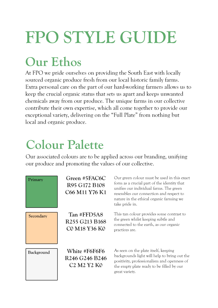
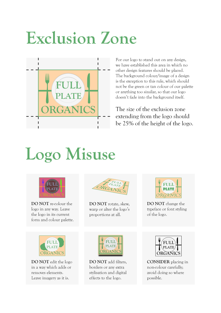
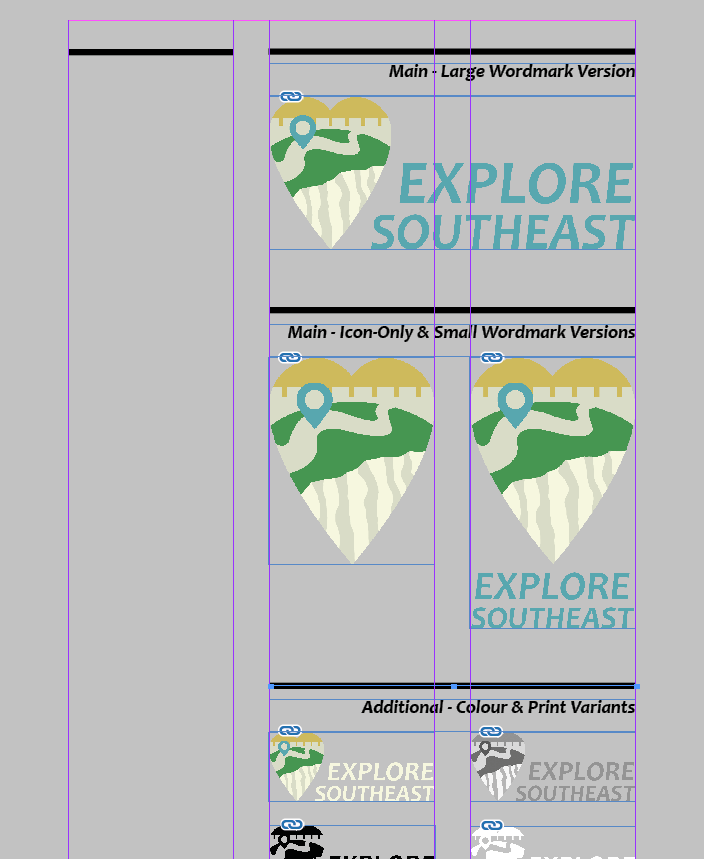
My client met my expectations in that they had a very clear understanding of what they wanted to include in the details and message of the charity. The client was professional in our communications and clear in their instructions which met my expectations. The client exceeded my expectations in being so pleasant to work with; understanding of the limitations of my time set out by the group briefing of the design volunteers project, and very encouraging and receptive to my suggestions on placing the dense word content in the design outcomes. This working relationship increased my motivation to work promptly for the client, especially knowing the good cause of the charity’s work I was promoting. My expectations were also exceeded by finding that the charity had in-place a solid brand identity held together in the style guide provided to me. This simplified some aspects of the designing process, working in a specific set of colours, typefaces, and having a logo ready to apply. Because of preparation I went into the process not expecting significant design knowledge or ability to help on the part of the client. In some ways this did hold true as I found myself able to advise the client on altering the placement of certain parts of the contents and requesting certain appropriate imagery, which was a very rewarding experience to be in the position of the design professional as a student. In other ways however the client’s eye for ideal corrections in the content they originally provided and specific adjustments to meet their vision exceeded my expectations in a positive way. It is difficult to say if I met the expectations of my client but their words have been very kind towards me, expressing approval of the work I have produced with them. I kept my communications consistent and detailed which I found helped the working relationship.

In what ways did classes or talks in uni prepare you for managing your client relationship and avoiding the consequences of not managing your client relationship well? Give concrete examples.

One piece of advice given in the preparation for the project was to keep up the communication – to a respectful extent. Tendencies to hold back in communication from a place of concern not to bother the busy client were balanced out by the important notion that keeping communication frequent and respectful would produce a productive working relationship, which it did. In earlier development of leaflet outcomes, I found there was a lack of imagery I could use to illustrate the positive messages from the client in the text provided by them. I had to be proactive in requesting new imagery or access to some existing imagery which hadn’t yet been made available to me. The client was happily able to meet this request, and if I had held back in communicating this the leaflets would lack in some content which has great value in showing the positive impact of their work reflected in the attractive facilities they offer and visibly happy people they serve. The importance of keeping respectful and positive, learning about what the charity does and being patient to any causes for delay on the end of the client were also advised to me before getting into the project, which put me into the right frame of mind to work successfully.

You may remember the phrase, “The Universe gave you this client to learn about yourself”. What did you learn about yourself and what do you plan to do with that knowledge?

I learned sometimes I need to be more proactive to get the most out of something. I found a working relationship which did not pile pressure on me; deadlines were not set, critical appointments were not put in place, the workload was manageable. This helped me to keep a positive relationship with the project as it balanced on top of my other work, but I realise that clients in the future may not be this way. But what having the low pressure taught me was that it was up to me to produce work as efficiently as I could and to as high standard as I was able to, to end up being as helpful for the charity as I possible and to end up with designs which add to my portfolio meaningfully and pushed my experience forward. I found in some ways I did not push myself far enough to get the absolute most out of this project; I stuck to the style guide’s themes and didn’t do much to add a flair of visual interest since I was so focused on fitting all of the content on the leaflets/booklet as well as possible. If I were to be faced with a comparable brief and client relationship in the future, I would think more about what extra features I can add to go above and beyond what the client requires and expects, to produce something that really leaves my own mark whilst still keeping within their identity. I have found upon reflection that my designs, whilst having attention to detail of how all the content will sit, ultimately come across that I “played it safe” to be sure that it would be to the client’s liking. This has taught me that taking the opportunity to push myself a little further and try out some different ideas, even when not explicitly being expected to do so, would be in my best interests as a designer looking to produce high quality outcomes – particularly in a situation like this where it is for an important cause.

How important did you consider the Design Vounteers work to be in comparison with your other University work? Why?

Being as it did not set deadlines and demand concepts that need to go through a lot of ideation upon in-depth research, there was a sense of the design volunteers work seeming less important or specifically less critical than other University work. Especially at times when main university work deadlines were approaching, and the design volunteer work did not have such a deadline and a very understanding client, I was able to find the client work to be more of a side project than the main important piece. However, in other ways I found the client work to be more important. More than my other work, I found myself putting in a lot of attention to detail with how all the content is set out on the design piece. I did not overlook the fact that this design work will directly reach a public audience and be held up as something which represents a very worthy charity, so I found it important not to make any mistakes or to have any slip in my professionalism. When sending files I had to make absolutely sure that I was providing every format and piece of information to mean the designs could be used successfully as the go into the hands of the client. Working for other people put on an extra feeling of responsibility, and when holding up communications via email I would re-read my messages thoroughly to make sure all of my progress, questions or suggestions were conveyed as clearly as possible. These steps set this client work apart from my regular university work where design is for my personal portfolio and course success only.

In what ways has Design Volunteers increased your understanding of working professionally on a live brief?

There are a few things about working professionally on a live brief I have gained from Design Volunteers. It gave me an experience where all of the resources I needed from the clients – images to go on design pieces in this case – were not initially made available to me. It was important for me to know exactly what would be needed to produce a satisfactory design outcome and be proactive in addressing this issue with polite and well-explained communication. It also put me in a position of being the person in the working relation with the most graphic design knowledge, where I had to design in a way which respected all the wishes and requirements of design but also made suggestions and advise the client that some things would benefit from slight adjustment. For example I was tasked with creating a booklet which had a specific contents put forward. As I came to planning how this content will all look in the booklet format, it was clear that the plan left some pages with too much content to fit, and others with quite a lot less. I had to take the initiative of advising my client of this and suggesting a slight re-positioning where some content would change to sit on a different page. The page contents was set out in a way which was quite definitive, reflecting previous briefs that have a certain set of specific deliverables I have come into on the design course. I found that it was a better approach to make that suggestion for a change to result in a better booklet design; the client spoke highly of this attention to detail afterwards. It was a lesson in making the right call to take initiative in a live brief, putting design knowledge of spacing and layout to good use.

Another thing that struck me for this live brief were the extra steps the design needed to go through for approval. The logo of a charity authority had to be implemented with its own set of regulations followed, and designs submitted had to be approved of my people further up the chain of command than the client I communicated with through the project. I see the importance from this experience of taking into consideration a multitude of different people and authorities that have to come together in assuring the work I produce is suitable, this will apply to live briefs in the future.

What did you find most interesting, useful, engaging or enjoyable about the Design Volunteers experience? If nothing was, explain why this was the case. Give specific examples.

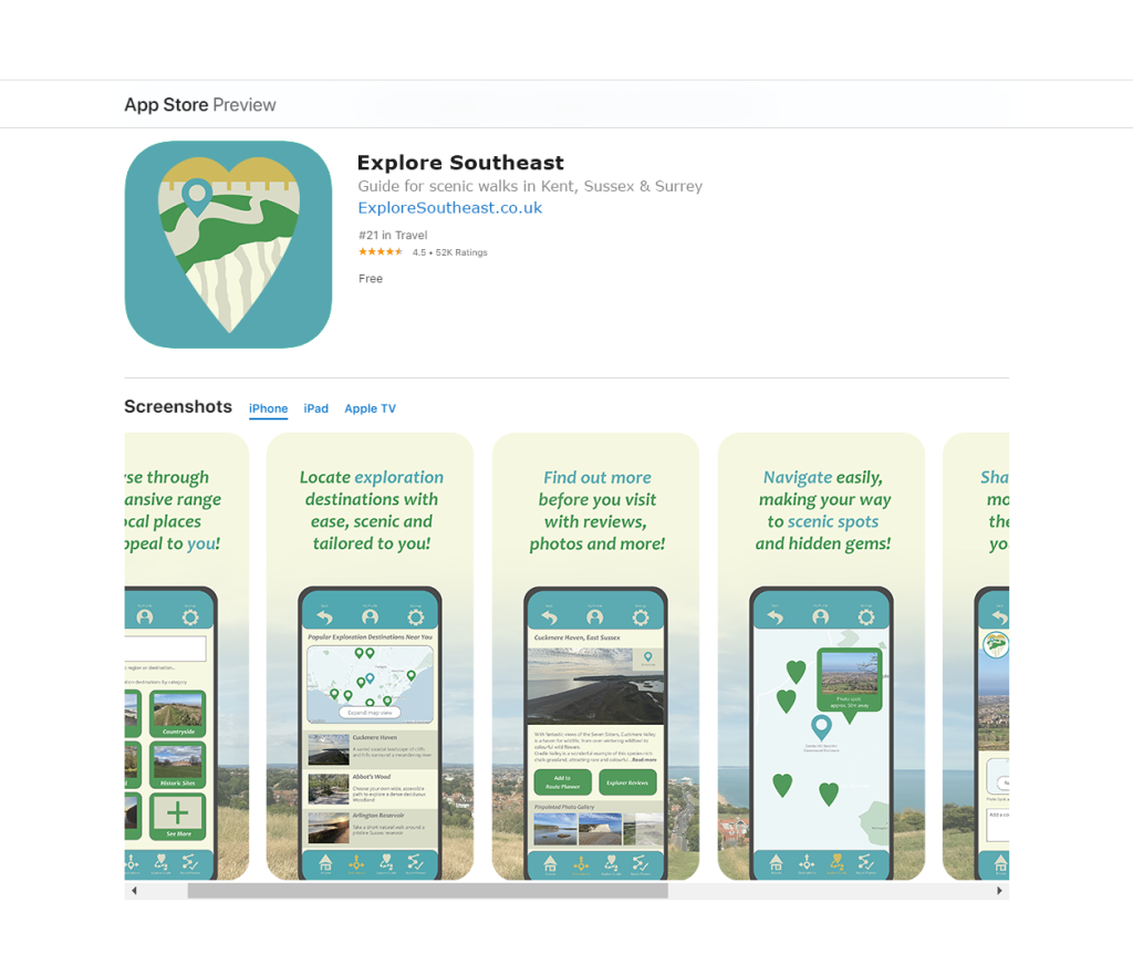
One aspect that made the project engaging was knowing the value of promoting the charity and the fact that it can come to influence a real audience. Design volunteers provided a design experience towards something that can actually have a small influence in the world, and knowing this made me want to get it right, representing the client as well as possible. I also appreciated the opportunity to be working with existing materials. I appreciate other design university opportunities which have me produce the entire concept and identity, but there was something I enjoyed about working with existing materials and doing my part to create an appropriate layout and presentation for that existing content. Not having to start from nothing kept my progress more consistent for this project and allowed me to reflect more on the fine details that made the design appropriate.

What future plans or targets have arisen for you based on something that you experienced during Design Volunteers? State the plan and what triggered this.

I would strive to increase my awareness of how to create visually interesting physical design pieces with layout choices, and to know the industry standard practice and noteworthy examples of how to fit a lot of content on a design piece that still holds a stand-out appeal. I became very focused on making sure everything fits well in the design outcome which was a careful balance to achieve, but upon reflection I find that it would be ideal if I could have done something to work to make the design seem more exceptional, whilst still serving to convey the soft, inviting style needed for the client message. So I would aim to find inspiring examples and experiment with adding features to a design that is dense with information as the client needs. I would additionally set myself a target to work for good causes as a socially responsible designer, perhaps being able to find opportunities to work for clients and be able to put in more time and research to enhance work I’d produce for them.

After having had this work experience, what have you already acted upon in your professional or personal life because you found it important or interesting within Design Volunteers? Please give concrete examples.

Professionally, as I found myself needing to send large files over to the client, I was needing to use cloud storage which was provided by my university. I recognise that this university-provided storage will not always be available to me, so I since looked into cloud storage options, thinking about how the industry is very much based in this instant way of sharing resources. Personally I was struck also by the dedication of my client’s charity and I took note of their appeal for people to choose to contribute towards their work by selecting them with SmileAmazon, so I have since set that up.

Design a site like this with WordPress.com
Get started